Strike Balance With Your Website Objectives
Through Clear Purpose And Consideration

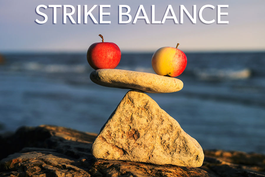
For a website that’s been thoughtfully planned, there will be meshed and interdependent objectives woven to create a well-purposed, well-functioning whole. It can seem that some website objectives are at odds and small business owners or those charged with overseeing the development and design of a website often grapple with this.
It can be challenging to strike a productive balance between communicating who we are and creating a user experience that will attract (even delight), serve our customers. And fulfill our business needs in order to generate necessary conversions and reach our goals. [Tweet “After all, what good is a website if it doesn’t deliver what a business needs it to?”] The intent is to find the balance that supports it all.
On one hand there’s the freedom and perhaps even joyful opportunity to express our identity. And a lot needs to be communicated to give your visitors a strong sense of your business personality, character and style. It’s important to illustrate what it will be like to do business with you through messaging, look and feel, design.
And on the other hand it’s necessary to demonstrate acumen and expertise (and perhaps some selflessness) with language (messaging again), content, function. With calls to action that actually produce action. This, accomplished through a focus outward to concisely what your visitors (and potential customers) are looking for. The solutions to their problems, the answers to their questions, and an unwavering commitment to providing what they need without being sideways seduced by the overly egotistical or boastful possibilities that tempt. Or design flourishes that may distract.
[Tweet “There lies somewhere a perfect knitting together of intentions, goals and service.”] The question is always where and how to find that sweet spot. The just-right balance. And that’s going to differ for each business depending on your objectives for the performance of your website and your identity and industry.
Barriers To Finding The Balance
Because of the demands of owning and running a small business we can drift into somewhat isolated single-mindedness. In other words, we can become cloistered. Not only cloistered from the outside but cloistered within our self-constructed divisions of perspective, of tasks.
Naturally, one of our baseline priorities is to keep things running efficiently, productively; to maintain vitality. We hunker down within our self-contained worlds fostering our purpose in order to best serve those who are counting on us. Our customers, clients come first. And then there are our incoming clients or customers, people who are aware of our actions, work and content, our readers.
They are each hopefully gleaning clues, information and ideas that can be repurposed and utilized within their own small business worlds thus creating an exchange.
But along the way, we naturally begin to make separations between tasks and objectives. Between this part of running the business and that. That can make fuzzy the conglomeration of those objectives I mentioned at the start. We begin to lose sight of certain business needs.
We Poke Our Heads Above The Water Line And Are Reminded
Our connected online world offers us resources beyond our own walls and smallish communities and we are able to benefit from them readily. In turn, we provide resources to others.
It’s a great thing. And it may just be one of the preliminary steps in finding that balance for our own website objectives. We become informed. We learn what others are thinking about and consider important. We have access to our potential customer base and find out what they need and are looking for. And stats, our detectives, to clue us in to what’s actually going on with our sites.
Finding Balance Beyond Walls
[Tweet “How do we reach across the boundaries of our website walls? “] Reach through our physical walls and the walls of our perceptions to offer solutions, share knowledge, intelligence and wisdom? And at the same time suitably announce who we are? Introduce ourselves properly. Communicate our personality, business essence, company culture? And ultimately feed our bottom line.
A Personal Wall-Allegory
In our days as visual artists, finding the right space to make our art was no mean feat, one to celebrate. We needed big, open spaces with high ceilings to accommodate large canvases, room to breathe ideas and experiment; make a big mess. Early on, we moved into our first loft and lived and worked there for many years, got married inside those walls as a matter of fact. It was around 2000 top-floor square feet in an old leather factory on South Street in the Leather District in Boston. It became our personal creativity factory with the classic high ceilings and arched windows of movies and ancient factory floorboards wide and wide enough apart to drip paint through onto our downstairs neighbor’s white couches. She wasn’t an artist but she loved artists and wanted to breath their air so we were miraculously forgiven.
As there were two of us with our entirely separate needs and dreams for space, we were grateful for the one wall the previous tenant had erected dividing the loft in two. One side was Doug’s studio with back alley windows, a couch and a tiny L shaped crag for the freight elevator landing and a teeny makeshift kitchen. The other side was mine and where we slept. A bit smaller especially if you considered the small safe zone that had to surround the sleeping area perhaps but it had the highest ceiling, streaming light from the huge glass arches and a view of the street, below.
There was a time when curiosity abducted us and we decided to see what it would be like if we broke down the wall and out came the reciprocating saw and sledge hammer. We demolished the one boundary we had thinking it would feel expansive and perhaps lend itself to an even deeper creative productivity.
The wall came down and our hearts sank. The glorious spaciousness shrank into a dismal four walls containing us in a way that felt unpleasant and stifling. We were a bit startled by what happened to our differentiation. We re-built the wall probably within a day and sighed with relief at the rebuilding of our separation.
It begged the questions: Why do we need that? How could we not?
Can Walls Teach Us Anything?
[Tweet “It boils down to awareness and sensitivity.”]
There’s something this little story re-reminds me about the need for certain walls and boundaries for the cultivation of the individual and creativity. A certain amount of gentle divide between inside and outside might help us to fine-tune what our contributions can be to the world. However, we also look for healthy cross-pollination.
What does this have to do with balancing the objectives for our websites? It points to the observations we can make about where our boundaries lie, what constitutes the edges of business. What do we let in and what do we share out? It begs another question about permeability. Of what we learn and how we apply it. It also brings to mind a vision of blurred restrictions about how we can use our business to build broadening community.
If you’re in the process of a website development or re-evaluating your current site you might consider these questions. Record your answers and use them as guidelines as you plan your project:
- What are your most pressing goals and your website objectives?
- How will you prompt your targeted visitors to action?
- How will you communicate who you are?
- Where are you finding the conversations of your targeted visitors/customers? Are you listening?
- Can you define the various areas of your business? Is there a flow between them?
- How can you preserve and best serve the needs of each fundamental area of your business via your website?
- Make a rough sketch or diagram that illustrates at least some of your answers. It doesn’t matter if you can’t draw. Just mess around and see what happens when you make it visual.
What Happened Next?
We live in a house nowadays. Two more lofts and many years later, we have real rooms and a fabulous converted garage that serves as our office and headquarters for our business that we often, unselfconsciously refer to as “the studio”.
SUBSCRIBE & RECEIVE BLOG NOTIFICATIONS OF NEW POSTS:
* Don’t miss any of our blog posts! Subscribe at the top right of this page.
GOOGLE PLUS POST NOTIFICATIONS:
* Please follow the Fat Eyes Blog Collection on Google Plus.
* Would you like to be included in my Google Plus Notification Circle?
If you would, please visit the invitation and let me know in the comments with a +mention of my name. Thanks!
Pre-Remixed Title Photo Credit: iStock Copyright: styf22
Re-mix by Gina Fiedel
We’ve recently installed Google+ Comments.
If you’d like to leave a COMMENT- PLEASE CHOOSE:
‘W’ for our WordPress comment


Thanks for the great tips! I do have a question however that I think you could probably answer.
I was wondering, What are some good projects/ideas in web development that
a beginner can start with to take his/her skills to the next level?
Any insight would be greatly appreciated!