When Design & Marketing Still Mean Something
Make It Better Than Good Enough
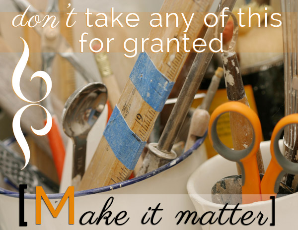
We’re drenched in opulent marketing [and self-marketing] abundance; seeped in opportunity and mechanisms with easy-ish design methods for getting our word out. And we can do every bit of it without getting our hands wet, dirty or needing to put on a smock. The convenience is outstanding, the pitfalls glaring yet often unseen, right under our noses. [Tweet “Don’t take any of this for granted. Make it matter.”]
Even meaning loses stability when the container it’s delivered in hasn’t been carefully constructed and matched with intent. If we settle, our message is compromised by default. It risks getting misplaced or lost. And what we’ve got then, may well be muddy, lacking clarity and distinction.
The tools for designing and producing marketing materials are more readily available than ever, making it wildly different from really not so long ago. The mystique and passionate dedication [and self-construed inherent power] of Mad Men has gone so far by the wayside that it’s almost passé to mention it. (though they were so ultra-cool on TV) We aren’t interested in, nor should we even get away with trying to manipulate our customers or the public. Broadcast marketing has been replaced by inbound marketing yet there seems to be an increasingly sweeping misconception that it’s easy to execute nowadays. And sometimes, even free.
Almost anyone might fancy herself [or himself] a designer or marketer regardless of whether they have training, hands on experience or not because of the multitude of DIY website applications, image creation apps, online tutorials and courses, social media pages, smartphone cameras and the like. With factors ranging from the status of world economy to the rise of self-employed professionals and the impressive stats on the current numbers of small businesses and then the exploding use of the internet and the rise of mobile, solutions answering to the pressures in small business to produce content without resources, it all adds up. It’s no wonder so many people are taking things into their own hands. And convincing themselves that what they make is good enough. But what about quality? What are the hidden costs?
The Glass Table
In the purely analog old days of the 60’s that featured hand-designed marketing with handmade mock-ups and samples, I played under my mother’s glass dining table desk. I drew or read while she worked in the room we called “The Blue Room” because it was painted the most stunningly deep hued blue. It was a bit of a thoroughfare with three doors, built-in cupboards circling the perimeter floor to ceiling with dark wood counters lining every bit of wall space not used for door or window. The old “butler’s pantry” traversed by all of us to get from one side of the house to the other complete with a pass-through window to the kitchen. But it was think-tank-creativity-central for my mom. I watched it all from underneath; the other side of the glass, looking up. It was also where Thanksgiving dinner was put out buffet style. And when I was older, where we ate dinner every night, on that same glass table. When it doubled as her laboratory, she tried to keep the traffic down.
I sought the proximity to her; it was a special treat when she was desk-bound, not teaching in the dance studio with the doors closed or commanding the grounds full of people and bustling activity. But whenever I poked my head up, or left to get more supplies or a snack and I could see everything that was covering the glass right side up, I was also entranced with what she was making; her work. Spellbound with her paper. Complex class schedules drawn out in grids with a ruler and pencil on giant sheets of paper that were bigger than the surface of the table, pasted mock-ups of brochures, contact sheets, cut up black and white photographs. Glue and scissors. Bic ballpoint pens and Letraset. Scraps and bits fallen to the floor. She concentrated hard. I wasn’t to disturb her. But merely witnessing quietly planted big seeds in my own mind.
Is Good Enough Good?
Granted, in a general sense, we’ve understood, if not agreed, that ‘good enough’ not only might really good enough, but it often needs to be for the sake of efficiency and production. That makes sense in terms of choice-making when we consider that the choices we have are out of control in so many areas. Sometimes, we just need to make a decision and call it a day.
Having too many choices also adds to the pressure to produce, oddly enough. If there are so many varied ways to accomplish something the repeated messages are that these tasks should be easy for anyone to accomplish, trained skills prevailing or not. People who wouldn’t otherwise even consider the option of designing and producing their own marketing goods suddenly feel they have to scrape together the skills.
Addressing that multitude of choices, in his TED talk, Barry Schwartz, American psychologist, author and professor at Swarthmore College said,
“One effect, paradoxically, is that it produces paralysis, rather than liberation. With so many options to choose from, people find it very difficult to choose at all. … So paralysis is a consequence of having too many choices.”
The hazard is that it can be taken too far, as a way off the hook, giving up, lowering standards, squeaking by with a less than good free ticket. Applied to the wrong things.
When it comes to the choices you make about business design pieces, your visual brand consistency, everything you put out into the world that represents you, they all deserve care, consideration and topnotch execution. You can’t just call it done when it isn’t.
Piece Of Cake?
[Tweet “Are we lowering the bar? Good enough really isn’t always good enough after all.”]
In some ways, things have become too easy even though it oftentimes remains dizzyingly hard work particularly when you consider the quantity we are churning out. But just as I advise against taking the accessibility of tools for granted, I also advise against fooling ourselves into believing that the quality of some of what is being produced is up to par.
Just like when we talk about the Fast Web [vs. The Slow Web], we have moved closer and closer to not only wanting but demanding instant gratification and fast turnarounds. With that move we risk sacrificing quality and we lose the sensitive, facile touch and soul that can only come from a human putting their hands to something [even if it’s the keyboard], to craft a well-made object [even if it’s two dimensional]. I’m referring to any and all digital marketing materials; websites, emails, blog posts, images, infographics, PDFs, video. All of it is vulnerable to too much rush and too much ‘good enough’. Not enough conviction and commitment.
How do we avoid compromising the thoughtfulness and care that goes into quality product while reconciling the fact that over-perfectionism, too much indulgence, extra fussing over what we do, putting too much effort into something simply isn’t efficient?
A Guideline To Consider
I appreciate this outline that was developed by Keith Frankel, after a long bout of trial and error on the Hubspot Blog:
A deliverable can be considered “good enough” when:
- It successfully solves the problem, addresses the need, or conveys the message intended,
- It is clearly and distinctly on brand,
- The quality of work is consistent with or above the level of previous work,
- It has been thoroughly yet objectively scrutinized by other qualified individuals, and*
- The final decision of preference had been left in the hands of the creator.
But I get a kick out of and especially like this quote from his friend, Richie Stewart. I certainly resonate with it as being a large part of my personal method:
“Dude, it’s good enough when the imperfections aren’t punching you in the face anymore.”
In small business, we are all, to one varying degree or another, tasked with marketing and producing the materials that requires. Not to take the fun of it away from anyone willing to play in the territory as a first time thing if you are hankering to develop and deepen you skills. Just a hint of warning to be aware of the message you are sending if you fall prey too often to “good enough”.
SUBSCRIBE & Receive Blog Notifications Of New Posts:
* Don’t miss any of our blog posts! Subscribe at the top right of this page.
Google Plus Post Notifications:
* Would you like to be included in my Google Plus Notification Circle?
If you would, please visit the invitation and let me know in the comments with a +mention of my name. Thanks!
[heavily] pre-mixed photo: iStock
We’ve recently installed Google+ Comments.
If you’d like to leave a COMMENT- PLEASE CHOOSE:
‘W’ for our WordPress commenting system,’G+’ for Google+, or ‘F’ for Facebook


