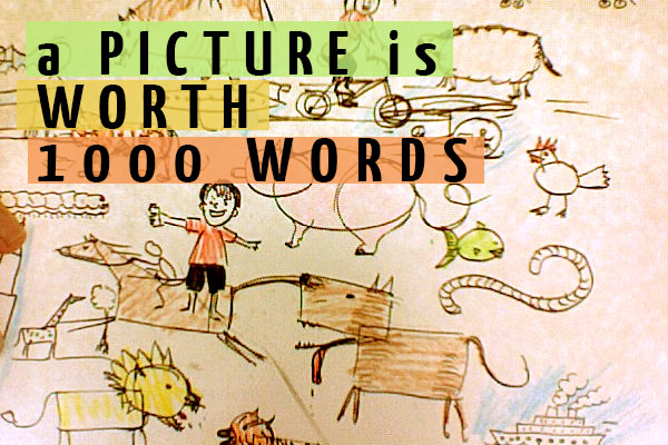
Eyes Wide Open – Fun With Pictures & Words: Infographics Part 1
Why It’s Time to Jump on the Infographic Bandwagon

Have you ever heard of a “Strawberry Fool”? It’s this delightful dessert from the 18th century; a pretty glass filled with whipped cream, strawberries and at the bottom is a “digestive biscuit” (doesn’t that just scream delicious?). But wait, what the heck does any of this have to do with infographics? You’re getting people hooked on the presentation (strawberries and whipped cream) and making that boring ol’ fiber cookie something they want to eat!
Infographics and data visualization allow you to take sometimes hard to swallow complex data and break it down into fun, entertaining, informative and most of all easily shareable information. It may not be edible like the Strawberry Fool, but yummy in other ways. In this post, we’re going to go over why they work and how to make one for your website.
Infographics Have Been With Us since the Beginning
The first infographics were cave paintings dating back to 35,000 – 40,000 years ago – they depicted large wild animals, bison, deer , tracings of human hands and the occasional rare depiction of a person (interesting fact, people appeared more in African cave art than European!) as well as abstract patterns. Their purpose is not fully known or understood, but regardless, cave paintings were a form of visual communication. Part graffiti, part sign post, as soon as humans figured out how to represent complex data (migration patterns of spotted horses for example) in a format others could understand we did it! From there we’ve shot them into space in hopes of meeting little green men and brand new customers, but what makes an infographic GOOD?
Why Infographics Work
They work because:
- Us humans tend to learn and retain information better with visual aids
- They’re Fun and Interesting
- They Lend Authority to You Online
- You and Others Can Share Them Anytime, Anywhere
There’s only so much we can do with black and white text, but when it comes to visualizing data in an easy to browse format it’s easy to see why people love them and can enjoy absorbing what you are setting out to illustrate!
It All Starts with a Plan
A plan to take over the world! And to make everyone wear tiny hats and act like their best goofball selves! Well, that’s MY plan, you probably just want to create an engaging infographic that’s going to get people to come to your website. And that’s really more reasonable anyway. There are four types of infographics:
Statistical infographics consist of numbers, percentages, statistics and statements that are compared with one another. (example: flowtown)
Timeline infographics consist of data, statistics and statements that are compared with a period of time (example: microsofttraining)
Location infographics consist of data, statistics and statements that are compared with maps and geography (example: visual.ly)
Process infographics consist of data, statistics and statements with a visualized workflow (example: visual.ly)
It’s VERY important to note that the infographic you end up with may be a combination (like a statistical timeline, or a process location). Depending on what data you have available you’ll get a different sort of infographic.
The right infographic for you may well be a combination of these four or just one, so it’s important not to get too hung up on exactly WHICH infographic you have to create. These are really determined by what data you have available to you in the planning stages, which brings us to the next step.
It’s Not Just About Graphics
A successful infographic has three parts:
- Research – Facts, data, deductions, all of these things need to be done first before you proceed with structure and presentation. Each statement and deduction must be backed up by sources, always keep a list of where you found a fact and always find at least two sources for each fact.
- Content – Relying on your earlier research you’ll need to pick great statistics, references and information you can plug into your infographic. This is the sticky part, since you’ll have to choose what’s really important for your readers to know and what needs to be left out.
- Presentation – The presentation, or visualization of the data, comes next. Style consistency- the look and feel, interesting, fun to look at graphics and illustrations are an essential part of the equation. Color coding (blue and red for example to show information for US election cycles), graphics and reference icons are all part of the presentation.
They may come third, but Graphics ARE Important Right?!
Yes! The graphical elements are fundamental in an infographic. After all, it’s called an infographic for a reason. Infographics visualize data in many ways like:
- Maps, charts and graphs
- Lists, timelines, diagrams
- Icons, fonts, colors, and illustrations
Your infographic doesn’t have to be heavy on graphics to be an infographic, but it does need to visualize data! And you want to make it a pleasure to look at. The seduction, fun and excitement of the first glance is what will draw your viewers in, make them interested in pursuing a good, careful look at your presentation of ideas.
Know the Difference between an Infographic and Infograffiti
Maybe you didn’t do your research, it may be artful, but maybe the structure is confusing and people can’t follow the path. If you’re not adding something of value and something to the conversation, your infographic isn’t a success. When infographics go wrong they become infograffiti. And I don’t mean the good kind of graffiti. Always be mindful about your data and what you’re putting out there or you could catch the attention of social media in all the wrong ways.
photo credit: jonny goldstein via photopin cc


