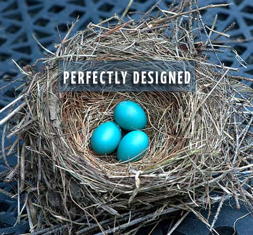
Strategic Web Design – What Makes it Good?
Good web design isn’t just about look and feel. It’s strategic.
I don’t know about you, but for me, the prospect of a brand new, bright and shiny web design makes me practically giddy with excitement. The moment of anticipation arrives with so much potential. Such opportunity. It reminds me of the crowded, bustling, noisy and colorful markets we visited in Haiti, Latin and South American when I was growing up. I would cross the threshold with the most heart quickening feeling of ‘everything is possible’. Finding treasure was just around the corner or behind that massive pile of stuff. Even just standing at the entrance contained a sense of wonder.
I don’t mean to infer that web design is like that, but the feeling of openness and possibility just prior to starting is similar. And then the process begins in earnest and it gets more complicated and daunting. There is a lot to achieve. A lot to keep track of and strategize.
This is an effort at giving you some of the key elements to consider as you approach your new web design. If you keep these points in mind, you will end up with a better, more effective web presence that supports and promotes your identity/branding, increases conversions, matches your company’s needs and provides the best possible vehicle for promoting whatever it is you do.
It’s Different Nowadays
For years, as screens were increasing in size, web design was edging towards covering every speck of the real estate, creating richer and deeper; layered visual experiences for users. Hallelujah, right? Not anymore.
Ironically, with smarter technology and the rising use of mobile and tablets, design has been shrinking, getting more streamlined, simple. Now sites are designed to be assimilated quickly by people on the move and literally moving around with their screens. The screen’s relationship to the body has completely changed. It is no longer a fixed object viewed by a seated user. Websites need to be easy to access and digest, sometimes in a single glance while walking across a room.
Mobile Friendly, Mobile Optimized and Responsive Design
Because of this, it’s necessary that your site be viewable and functional on multiple devices and better yet, responsive and self-adjusting to any device it is viewed on. The choices are:
- Responsive design, programmed for easy reading and navigating with a minimum of resizing, scrolling and panning, it will fluidly reformat to the device it is being viewed on. The site will automatically orient to fit the screen. It is the full site but elements are stacked.
- Mobile optimized sites are specially created separate versions of a website designed specifically for mobile devices. It will be a streamlined version pared down to the most crucial features.
- Mobile friendly design will look the same on a desktop or mobile device only smaller yet functions just as well if you aren’t concerned with the extra scrolling and zooming needed because the the size shift.
While Responsive is most definitely the optimal choice, many companies opt for making sure their website is mobile-friendly as it can be less costly than responsive. Responsive is less costly than mobile optimized, however, because you only need to develop one version of the site. If you fall into this category of mobile friendly, make sure your site has good presentation and functionality on tablets, phones and desktop- the former being the top priorities. If it works well on the smaller devices, it will on desktop.
Seduction
All that said, web design is still about seduction. We have mere seconds to draw in the visitor, convince them we have what they want and need, we are legitimate, worthy, capture their imagination and get them to buy whatever we may be selling, whether that be goods, ideas or information. This relies on evoking emotion. Our guts are the brains in these first few seconds. Those are the moments when you either grab your visitor’s attention or not and that’s when they bounce away off and running to one of your competitors.
Visual Hierarchy
Going further, building in visual organization or hierarchy is imperative. It’s important to guide the viewer’s attention effortlessly on the page and that means the layout cannot have competing areas. You want your users’ attention to be directed in the way you wish it to be. Ask yourself what needs to be seen first, second, third etc and make sure the design supports that order.
First Things First, However
Before all that juicy stuff can be applied, though, your developer needs to apply their active listening skills starting with asking you the critical questions before they will know enough to capture your identity. We call this the Discovery.
Who is your target audience, who are your competitors?
Together, explore the culture of the company, needs, objectives, challenges and for goodness sake, don’t leave out your business goals because this is the time to address them.
Look at where your old website falls short. What’s not working.
Examine how you may foster identity/branding with design, architecture, functionality and search-ability of the new site.
Achieving it All
To achieve this complex mix of objectives we use conventions, ingenuity and design wisdom and naturally, creativity.
A successful design strikes a balance with these fundamentals in place:
- Clear identity/branding
- Compelling look and feel
- Visual Hierarchy
- Strategic elixir of design and content
- Defined content areas
- SEO friendly site architecture
- Impeccably clear navigation
- Search-ability
- Mobile Friendly or better yet, Responsive
- Calls to action
Hopefully, this will give you a framework to use when approaching your next re-design and help you to set your goals resulting in good, solid, strategic design.
photo credit: nosha via photopin cc
-
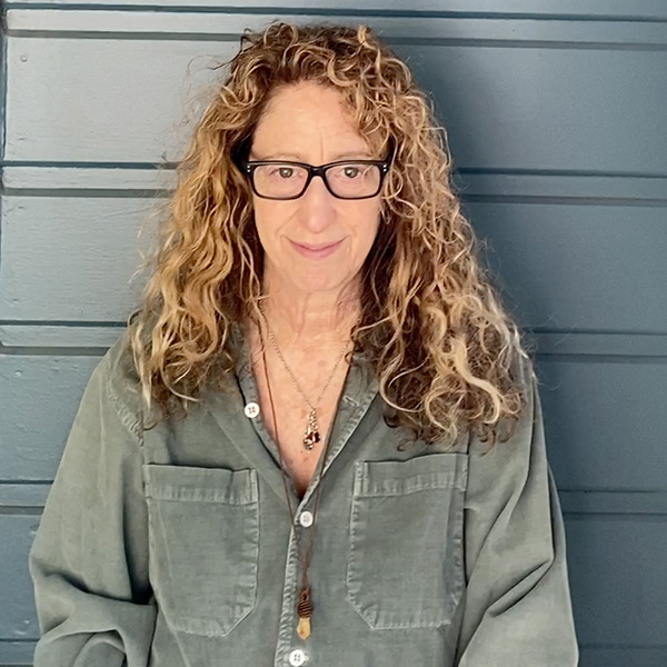
By: Gina Fiedel
Gina Fiedel is the co-founder/owner of Fat Eyes Web Development. After a successful career as an artist and transitioning into electronic media in the early 90’s, she then founded Fat Eyes in 1998 to bring those skills to the web with her husband, Doug Anderson. Being engaged in business has created gratifying opportunities for communication and new inroads towards making a contribution that counts. You can learn more about Gina on the Fat Eyes Who Are We? page and Gina Fiedel Story.
-


