Harnessing Brand Identity On Your Website
While Targeting Your Ideal Customer

Your website is your virtual anchor, the hub for all your online activities, your home base and the very center of your online identity. It’s the place where you have the greatest potential and generous real estate for swiftly communicating your most important asset and distinction: Who you are.
The personality and essence of your brand must be blatantly evident and felt throughout its pages and the blog. But there’s a catch.
har·nessing
~ Hitch up, put in harness, yoke, couple
~ Control and make use of, especially to produce energy.
~ To bring under conditions for effective use; gain control over for a particular end
Synonyms: channel, mobilize, apply, use, employ, exploit
Defining and harnessing your brand identity and targeting your ideal customer simultaneously, takes some finesse.
What Comes First?
Debates about design vs. functionality and whether form-follows-function or function-follows-form are rampant in the marketing and web development industries. We are firmly in the form-follows-function camp but at the same time, we also believe there is an interdependent relationship between the two.
The environment of a website, its look and feel and attention to visual detail play a critical role in its success as a communication and [differentiating] marketing tool because it’s in that realm that the expression of your brand identity begins to take place. Each visual element should be carefully considered and serve a useful purpose, lending itself one way or another to the greater whole, the wall-to-wall design. But! That rule can’t operate on its own because in the final analysis, those design details must all add up not only to the overall design but to the neatly wrapped and convicted conclusion that the design is there to support the delivery of the message and its usefulness to your targeted visitor. Each step of the way.
[Tweet “Design can do that: strengthen and support what you need to get across.”]
If you remove design, or overly diminish its purpose, there is no convincing container to put the message in and it loses power. If you have no compelling message, one that converts visitors, all you’ve got is a pretty picture.
…As they say, it’s complicated. [The relationship, that is]
Who’s It For, You Or Them?
Every organization or business website has a specific target audience [that make up their ideal customers] whether it be potential customers (or clients), existing customers, investors, donors, blog subscribers, members or a particular population who are in some kind of niche need. Oftentimes, it’s a cluster of types of visitors.
Depending on the kind of organization you are and the context of your industry, your website needs to be designed and organized for that ideal target audience, the people you most want to convert to paying customers, subscribers or supporters, influencers [those who will influence the buy within their organization]. These are your target customer profiles, your buyer persona -whatever name you assign that person, it’s the same. These are the people you want to convince and influence to take action.
While the website is in development, these are the people you will have in mind during every decision you make regarding the design and flow and with every piece of content you include. Your website is for them.
Who Do You Think You Are? Who Do They Think You Are?
This includes the visual language, visual design elements, the layout, navigation; the context for the content and the content itself. These all add up to the ability for someone coming to your site -for the first time- being able to quickly grasp (without effort) where they are and exactly what it is you’re about and what need of theirs you can fulfill. All this should begin to happen at a glance. If the whole of your message isn’t clearly directed to them, your website has already failed in its promise before your visitor even begins to read or browse. If you fail, your ideal target visitor, your potential customer, donor or investor, the visitor who is your buyer persona, will quickly lose interest, their attention will wander and as a result you will have tremendously less chance of converting them to customers.
Here’s The Catch
[Tweet “It’s All For Them But At The Same Time, It’s About You”]
The paradox, is that the identity, brand and the image that the website embodies needs to be your own.
The style and aesthetic with which you illustrate that is all about who you are. Your brand. Your identity. And yet…
It’s A Balancing Act
The task is to balance the messaging of your own identity with enough sensitivity to the identity of your visitor to make sure the expression of one becomes the appropriate container for the productive experience of the other.
Imagination and Creativity
There is always more than one way to look at or think about a thing or to describe it. To determine the best way takes some ingenuity and focus.
[Tweet “You can’t communicate or conduct commerce in a vacuum.”]
If your site doesn’t have a personality, your visitor is going to create one for you. They will project a personality onto you and you will subsequently lose control of your message.
Think of your website as a container to hold and communicate these things in the most clearly constructed fashion possible. With the design [the look and feel] and the content joining together to impart your brand identity:
- What you do, your product or services
- Your mission, your purpose, your ‘why’
- Your essence and personality, the character of your business, your style
- How you are unique and different, what you have to offer that is singular
Change Your Mind
Undo your black and white thinking to make room in your comprehension to hold both of these imperatives at once: Communicating your brand identity and appealing succinctly to the particular needs of your ideal customer. Do not fail to direct that singular, very unique offering to your ideal customer to let them know what you will deliver to fulfill their pressing need. In other words….
Make Sure You Are Offering Two For One
Your brand identity will be illustrated not only through words but also by the environment of your website which is, in essence, the design. But your website will fail to convert if you aren’t directing its message to your ideal target visitors. Supply both.
By The Way (now for the fun stuff)
This requires a bit of critical thinking to apply. But an interesting juxtaposition, almost antithetical and then also so closely related to what I’m discussing is the unsuspecting example of Minimalist Art, a movement in the visual art from the 1960’s to early 70’s. We are never without context and history. [Tweet “Everything that’s happened will inform what we do now.”]
Take some, leave some.
“Minimal Art is a school of abstract painting and sculpture where any kind of personal expression is kept to a minimum, in order to give the work a completely literal presence. The resulting work is characterized by extreme simplicity of form and a deliberate lack of expressive content.”
“The Minimalists, who believed that Action painting was too personal and insubstantial, adopted the point of view that a work of art should not refer to anything other than itself. For that reason they attempted to rid their works of any extra-visual association.”
“Minimalists distanced themselves … by removing suggestions of biography from their art or, indeed, metaphors of any kind. This denial of expression coupled with an interest in making objects that avoided the appearance of fine art led to the creation of sleek, geometric works that purposefully and radically eschew conventional aesthetic appeal.” – The Art Story, Modern Art Insight
“The central principle is that not the artist’s expression, but the medium and materials of the work are its reality. In other words: a work of art should not refer to anything other than itself. As minimalist painter Frank Stella once said: “What you see is what you see”. “– Introduction to Minimalism
This points the search for meaning back onto the viewer.
In order to manage this redirection, artists worked at removing suggestions of self-expression including metaphorical associations, representation, meaning, sentiment, emotion, social commentary or any other indications that the artist was creating personal expression.
(last word: remember, though, simplicity and directness of form is actually good in web design)

Donald Judd, Concrete box (circa 1968) photo source Brasket Art Blog

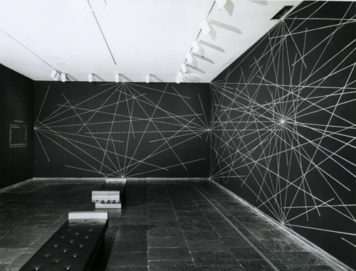
Sol Lewitt – Photo source Learn to Code, Sermad
SUBSCRIBE & Receive Blog Notifications Of New Posts:
* Don’t miss any of our blog posts! Subscribe at the top right of this page.
Google Plus Post Notifications:
* Would you like to be included in my Google Plus Notification Circle?
If you would, please visit the invitation and let me know in the comments with a +mention of my name. Thanks!
[heavily] pre-mixed photo: iStock
We’ve recently installed Google+ Comments.
If you’d like to leave a COMMENT- PLEASE CHOOSE:
‘W’ for our WordPress commenting system,’G+’ for Google+, or ‘F’ for Facebook


